Ad Campaign 2016 #SageSummit
We launched our latest campaign at #SageSummit 2016 with our new adverts/flyers and will be sending these out over the next year using email and snail mail (have to keep the postmen busy). Why still use snail mail? Well I think it’s unusual for people now to get a letter so it might grab their attention. That’s the theory anyway.
Our original aim was to produce standard single page handouts/brochures on our products and we had one completed for Customer365 when we decided it was a bit boring for #SageSummit.
We wondered how ours would compete with the 100’s of brochures from other companies? I thought it would be just more noise and to be honest I have brochures from other companies and they’re hard going to read and not very inspiring. We already had a brochure for Accelerator and started doing the same for Customer365 and pretty much had that done.
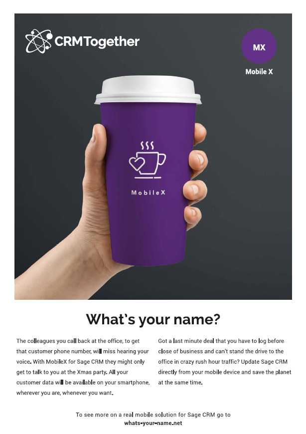
So we started the MobileX brochure and kinda by accident came up with the “Take Away” cup playing on “take away data”. So we compared the 2 approaches and decided to scrap the formal one we had for customer 365 and look again as to how we could approach this.
Our process was then inspired by the classic Volkswagen adverts from the 60’s/70’s.
We decided that if we could make people smile they won’t forget us. So tongue firmly in cheek we cracked on and brain dumped a lot of ideas, bounced them back and forward and came up with the following:
MobileX
MobileX was the first one we did and we felt we caught the “on the move” thing with the take away coffee cup image. The text then was designed to deliver the unexpected with an apology for how this app will change your life and help you save the planet. We needed a catchy line also and “What’s your name?” is based on what some coffee shops ask when you order and also the need for information.
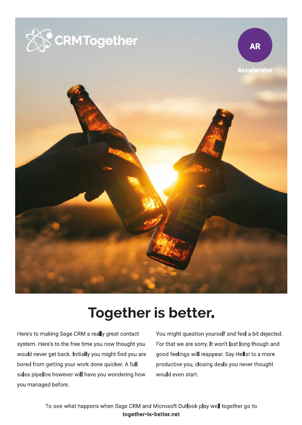
Accelerator
The Accelerator Outlook integration still causes some controversy as initially people see beer bottles (alcohol has some taboo around it hence the controversy). It is in fact root beer. The image though is about togetherness in real life and how Sage CRM and Outlook together delivers the same feeling. The “Together is Better” tagline we felt was just nice.
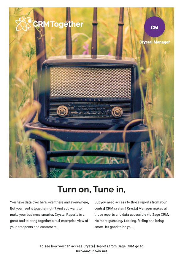
Crystal Manager
Crystal Manager was a tough one. The tool itself is not so visual and is more an invisible integration. So this made it difficult to conceptualize. We eventually came up with a tagline (Sandra, my wife provided this). The original line was “Turn on. Tune in. Drop out”.
We figured that as the “drop out” part had some LSD connotations (see https://en.wikipedia.org/wiki/Turn_on,_tune_in,_drop_out) we could not use this and besides it had no relevancy to what we were trying to convey which was to “Turn on” CRM and “Tune in” to your data/customers.
The radio image came then with the “tune in” line as it fit in although radio is not visual where reports are but the basic principle still applied where you got the information you wanted.
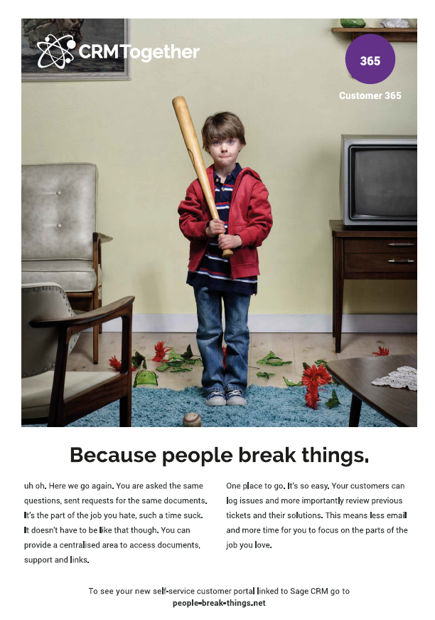
Customer365
Finally, we went back to Customer365 and this seems to be everyone’s favorite image. We found the image first and then came up with the tag line. We then made the text start off rather unusually with “uh oh”. The aim all of the time to keep people interested and then be relevant and resonate and make them want to get in touch to find out more. You will notice we don’t provide any features list or even benefits mostly. If we do people have the information and may then not need to contact us.
We deliberately set out to talk at a very high level of what the products did. We only vaguely mention the product in most cases and speak more about situations.
Landing pages
Originally we had the landing page as the product pages. One thing occurred to me though was that if people have been to your web-site chances are they won’t bother going again. So we bought some custom domains and put those in. We thought that they were fun and people might be more likely to then type them in. They redirect to pages we have on the site with the image (so they know they are in the right place) and a video and some text and a call to action. At the end of the day if people don’t click on the call to action and we (or a partner) don’t close the deal then the campaign will have failed.
*The landing pages are now defunct*
So our plan is to run this for a year and see how we go. We will be snail mailing out slowly over that time as well as doing mail shots. We also hope that partners will use these also and we can add their logo on if they want to do a campaign themselves and help with this.
I thought I would share with you how this came about and some of the inspiration we had. We worked with Dave from “Hidden Depth” on this. It was a ton of work but very enjoyable overall and we are quite proud of it. I hope you like it too.


