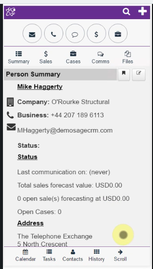
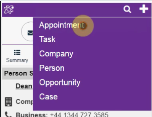
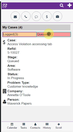
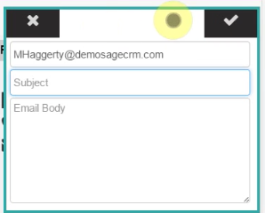
We have completed some UI changes to MobileX that will be released the week of 14th Sept 2016.
Short video here…
Our aim was to enhance usability and visibility (font size) based upon feedback from Sage Summit 2016.
- Removed the border from entity buttons.
- Search edit only appears when in use, you must click on the search icon to activate
- Moved the + button from the left to the top right making it easier to use with one hand.
- Included a new plugin to view a user’s case list from CRM.
- Changed how the dialogs appeared to introduce more consistency i.e. Cancel and save buttons now show in the top left and top right respectively.


